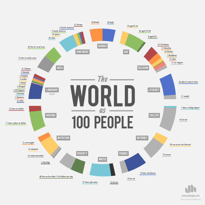
Today’s infographic shows a remarkable study in simplification. Jack Hagley’s design shows that if the entire world were conveniently simplified to 100 people (ie equating a percentage as a number of people). It will show how our world compares as a whole in different areas of life. As a person living in a free country with many rights and privileges, it gave me quite a lot of perspective.
Take, for instance, the fact that if the entire world were 100 people, 17 of you would not be able to read these words. In fact, only 22 of you would even have the access to a computer to read this, literacy or not! But even if you could read and had a computer to read this, only 5 of you would be able to read English-how’s that for a slim chance of making a difference! Thankfully, the world is not composed of just 100 people. There are billions of us which means that there are billions of times more than the numbers above! Though I would have loved some more categories – how many have access to cell phones, sexual preference etc. I think that this infographic simplifies a lot of information in a neat way! Let us know what you think! Were you surprised by any of the statistics?
*If you’re interested in buying this poster, it’s available for purchase here. Daily Infographic may receive a few pennies of affiliate commission if you do buy.


