
Today’s infographic is a perfect amalgam of two of my New Year’s resolutions: money management and fitness. And I suspect I am not alone. Changing out the calendar somehow lets us wipe the slate clean and vow that this, yes this, is our year. We will finally learn to maintain impeccable control over our finances and reach our goal weight. It isn’t realistic, but it is optimistic!
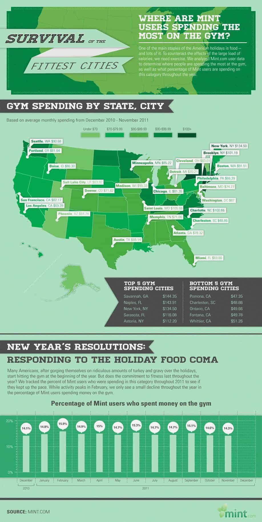
Following this idea, Mint.com tracked its user’s average gym spending by city to determine which cities spend more on average at the gym than others. This difference in spending could either be due to varying membership prices or members in the higher spending cities belonging to multiple gyms. It isn’t clear how the information should be interpreted. The infographic also examines how faithful gym members were throughout the year. While the graph shows only a minimal dip in gym spending activity as the year wanes, I wonder if that is more due to forgotten direct billing than actual attendance. [via]