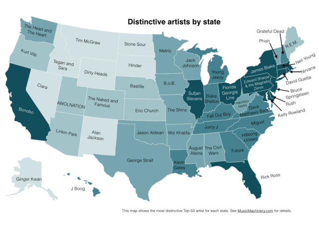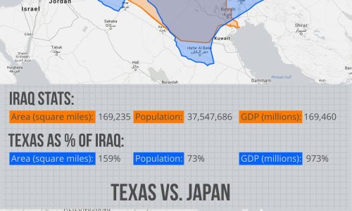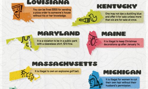
This is a great infographic because it actually uses some real number crunching to reveal information that would be pretty tedious to figure out by your own means. It might seem like it, but this isn’t just a here’s-your-state’s-most-listen-to-artist type of thing.
Being from Texas the first thing I noticed was George Strait, which yeah duh I’ve heard of him and no I am not at all surprised that he took the number one spot. Then after closer inspection at the rest of the states I’m thinking “Huh, there’s a few of these artists I’ve never even heard of. That can’t be right I know more about music than anyone. There’s gotta be some kind of mistake and whoever made this should have asked for my help.” Once I looked into how they came up with these statistics it started to make more sense.
Maybe I don’t know who Ginger Kwan is, but I can also totally understand how someone from Alaska could be completely unaware of who George Strait is. What’s taken into account when this was calculated is not just how much a particular state listens to an artist, but also how little every other state is listening to them. So what you’re getting from this is “Oh okay so Virgina is listening to a lot more Dave Matthews Band than everyone else.”, which is the kind of information that can really speak volumes about a place.


