There are thousands of companies marketing to consumers (both prospective and returning) several times per day, all of them with their own unique logo. Even the simplest company logos have a high amount of thought and time put into them, from logos representing small businesses all the way to logos for colossal corporations. One of the most important aspects in choosing the symbol that will define your company, and the self-image that you are presenting to your prospective consumer, is not necessarily the design itself but rather its color.
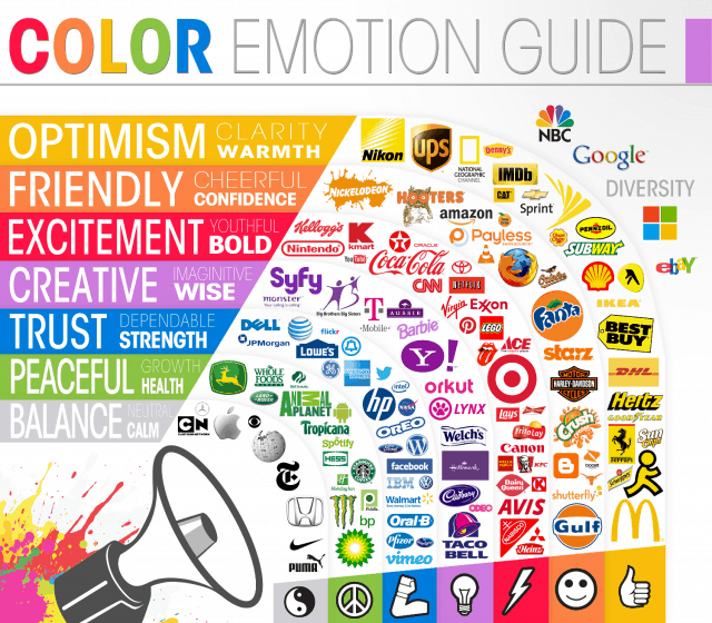
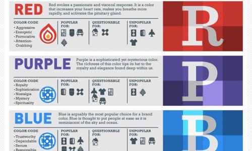
Today’s infographic gives us a look into the choice of colors worn by the logos that we see every day. Do you want your company to give off a sense of excitement or boldness? Red might be the color for you then. How about if you want your customers to feel like your company is trustworthy and dependable? You might want a nice, light shade of blue in that case.
Logos often are the first image anyone sees, reminding them of what the company stands for. Now you know a little bit about what goes into the design.


