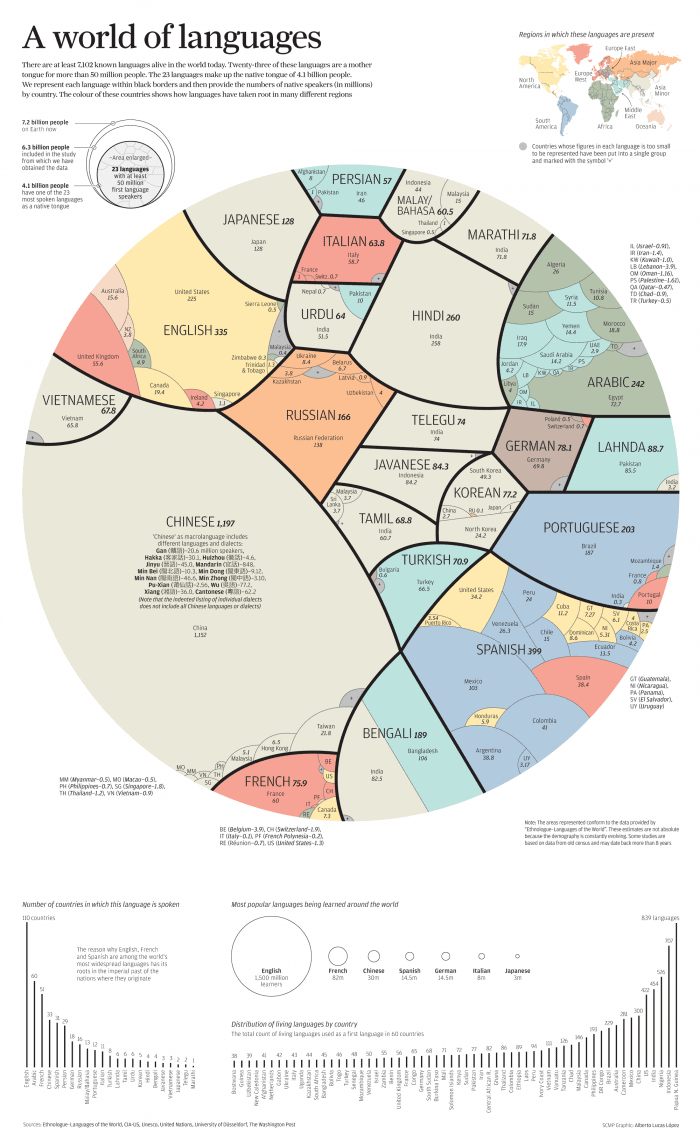
Data on spoken languages across the entire globe is not that easy to come by and, as the author admits, some of the census data used is over eight years old. Projects like this are still interesting, even if they cant be flawlessly accurate. Going forward the growth of mobile devices and the internet will make gathering this sort of data easier, and having something to compare it to as far back as possible will be valuable.
It’s important to note that the big circular graph is referring to “mother tongues.” If a person knows more than one language, this graph only represents their first language. A person born in Mexico who later became fluent in English would only count as a Spanish speaker. The graphs at the bottom, however, reveal the bi-tri-whatever lingual reality. We all know that English is a big deal, but dang, at 1,500 million learners we are crushing the competition. Take that, French.
Perhaps you are inspired to learn a new language yourself? Check out this infographic guide to the easiest and hardest languages for speakers of European languages to learn.


