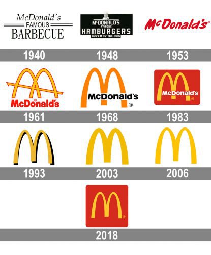
McDonald’s has been one of the most successful fast food chains in the country for decades. It’s also one of the most recognizable logos in the world, and its yellow M has appeared in every corner of the globe. However, this wasn’t always the case: The logo we all know was only introduced in 1968! So how did it get from that first “M” to today’s iconic design? Let’s take a look at McDonald’s logo evolution through the years…
McDonald’s first opened its doors in 1940
McDonald’s first opened its doors in 1940, but the company didn’t become what it is today until 1961. That was when it was bought by Ray Kroc, who continued to expand the brand across America and eventually become a global powerhouse. In 1965, McDonald’s became a publicly traded company, meaning that anyone could buy shares in the business. Today there are over 36,000 stores around the world and more than 1 million people working for them—and those numbers just keep growing!
The logo remained the same for the next two decades.
When you think about the McDonald’s logo, you probably imagine a hamburger with two capital “M”s for buns and a lowercase “d” in between them. That was actually created by Bob Bernstein in 1967. It was used from 1940 to 1968; during this time, it was on signs, bags, and cups all over America.
In 1968, the iconic “M” was created.
In 1968, the iconic “M” was created. The stylized representation of McDonald’s name is always red, yellow and white; it has a double arch shape with a smaller double curve at the top and a dot in the center.
The famous Ronald McDonald was introduced in 1963
The famous Ronald McDonald was introduced in 1963, appearing in a TV commercial for the first time. Originally played by Willard Scott and named after the McDonald’s brothers’ grandfather, Ronald McDonald has evolved into a redheaded, red-shirted mascot with a whimsical personality. In this section of our article we’ll take a look at some of his many appearances over the years—and even show you how you can get your own official Ronald costume!
McDonald’s went international in 1967.
In 1967, McDonald’s opened its first international restaurant in Canada. This was followed by Puerto Rico in 1968 and Germany in 1971.
In 2007, the company introduced the McCafe coffee shops to its U.S. stores.
In 2007, McDonald’s introduced the McCafe brand to its U.S. stores. The McCafe serves premium coffees, espresso drinks, and teas. They also serve breakfast sandwiches, croissants, muffins and pies.
The company doesn’t change logos very often but when they do it’s always with huge fanfare
And finally, it’s worth noting that McDonald’s doesn’t change their logos very often. When they do make a change, however, there’s always a big fanfare about it. The last time the company did this was in 2015 when they unveiled their new look after 45 years of only slight adjustments to the original design. In an interview with Fast Company, McDonald’s Chief Marketing Officer Deborah Wahl explained that the new logo is intended to be more modern and inclusive: “The previous logo was so famous and so beloved by millions around the world… It had been around for so long that it became something that maybe wasn’t as relevant as we wanted it to be,” said Wahl in an interview with Fast Company magazine.”It felt like we were missing an opportunity.”
It’s interesting to see the evolution of McDonald’s logos over the years. The company is one of the most recognizable brands in the world and their marketing campaigns have been incredibly successful because they’ve had such a consistent message throughout them all. When they do make changes though, it seems like everyone notices! We think that’s because people really have an emotional connection to these restaurants – whether good or bad.
This shows how important the logo is for brand development. And developing brands that want their brand logos to reach people’s hearts and minds can carry out some marketing activities. For example, custom derivative products can be given to consumers or be used in marketing and public events, such as custom logo pins, stickers, lanyards, etc. At BPS , it is possible to customize these products to meet the needs of your business.
