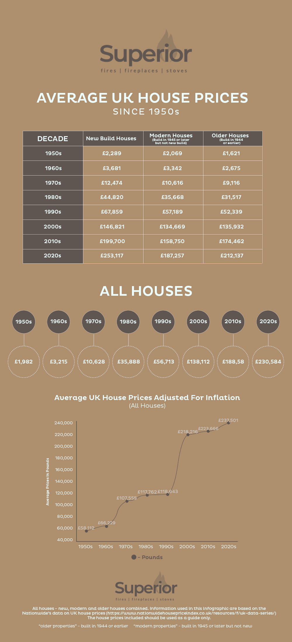

The best way to understand house prices and the way that they have changed over the decades, is by looking at the statistics: facts and figures never lie. This handy infographic shows where and when house prices have increased and what the difference is now, compared with each of the past seven decades.