The Netflix navigation menu is a great place to study human psychology. Every inch of the screen has been a/b tested to maximize the time you spend on the app.
Aside from creating huge amounts of high quality content, bringing on big name actors and directors, and delivering it all at a very affordable price, Netflix is also using human psychology to it’s advantage.
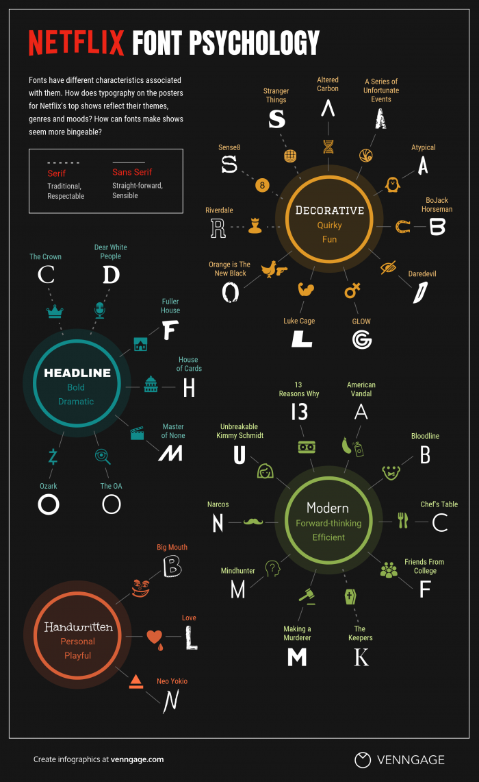
Netflix uses categories, the ordering of their navigation menu, and colors in hopes of getting the users to take certain actions. They also use an array of fonts to reflect themes, genres, and moods of their content.
The four major font categories Netflix employs are decorative, headline, modern and handwritten.
While there isn’t a specific font type that makes users more likely to binge a show, it is more important that the font matches the look and feel of the show. Once a user watches an episode, the next time they are scrolling through the menu and they see the font and cover art, they will get either a positive or a negative feeling about it. This could make them more likely to continue watching the show, or even begin watching it for the first time.
While other streaming services have begun using these techniques, Netflix is still the pioneer. Many of the other streaming services place more emphasis on continuity between shows and across their platform, while Netflix lets each of their shows stand out and be themselves.
So the next time you’re searching for a show in the Netflix navigation menu, just know they are playing with your psychology!
